Table of Contents
- What is DPI?
- 300 DPI: The Gold Standard for Print
- 72 DPI: The King of the Web
- The Big Mistake: “Upsampling”
- Summary Table: 300 DPI vs 72 DPI
- Frequently Asked Questions
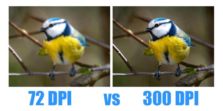
In the world of graphic design, few things cause as much confusion for beginners as image resolution. You’ve likely heard the terms 300 DPI and 72 DPI thrown around, usually with the warning that using the wrong one will ruin your project.
As a designer, understanding the difference between 300 DPI vs 72 DPI printing is the difference between a crisp, professional product and a blurry, pixelated mess. Let’s break down exactly what these numbers mean and when you should use them.
What is DPI?
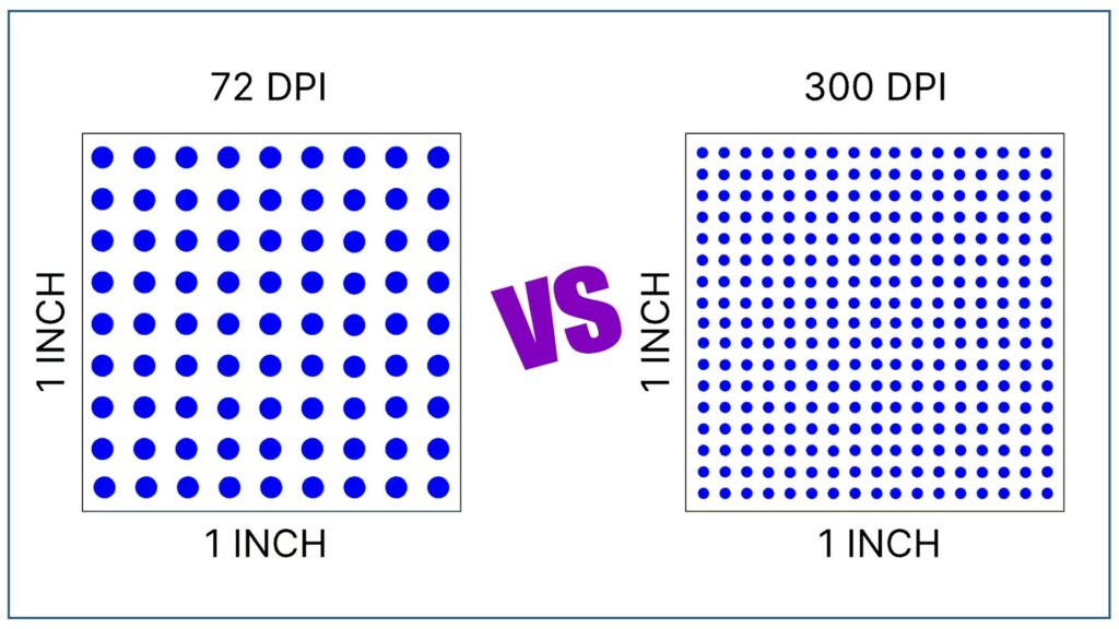
DPI stands for Dots Per Inch. It describes how many actual ink dots a printer places on a square inch of paper.
- High DPI (300): More dots packed together, resulting in higher detail and sharpness.
- Low DPI (72): Fewer dots spread out, resulting in less detail.
Note: In digital design, you might also see PPI (Pixels Per Inch). While technically different (pixels are for screens, dots are for paper), the industry often uses the terms interchangeably when setting up files.
300 DPI: The Gold Standard for Print
When your work is leaving the screen and heading to a physical printer—whether it’s a business card, a wedding album, or a brochure—300 DPI is the industry standard.
Why 300 DPI? Printers require much more data than screens to create a clear image. At 300 DPI, the dots of ink are so close together that the human eye cannot distinguish them, creating smooth gradients and sharp text.
Common uses for 300 DPI:
- Business cards and stationery.
- Photographs and wedding albums (e.g., 12×36 or 16×24 formats).
- Flyers, brochures, and magazines.
- Fine art prints.
72 DPI: The King of the Web
If your design is only ever going to be seen on a monitor, smartphone, or tablet, 72 DPI (or 96 DPI) is typically sufficient.
Why 72 DPI? Digital screens have a fixed number of pixels. An image with 300 DPI won’t actually look “sharper” on a standard screen than a 72 DPI image—it will just have a much larger file size. Using 300 DPI for the web can slow down website loading speeds and eat up storage space.
Common uses for 72 DPI:
- Website banners and blog images.
- Social media posts (Instagram, Facebook).
- Email newsletters.
- Digital advertisements.
The Big Mistake: “Upsampling”
A common trap for new designers is trying to turn a 72 DPI web image into a 300 DPI print image.
If you take a low-resolution photo from the internet and simply change the settings to 300 DPI in Photoshop, the software has to “guess” where to put the extra dots. This results in interpolation, which makes the image look blurry, “muddy,” or pixelated.
The Rule of Thumb: You can always scale down (300 DPI to 72 DPI), but you can almost never scale up without losing quality. Always start your projects at 300 DPI if there is even a small chance they will be printed.
Summary Table: 300 DPI vs 72 DPI
| Feature | 72 DPI | 300 DPI |
| Best For | Web, Social Media, Apps | Printing, Physical Media |
| File Size | Small (Fast Loading) | Large (Detailed) |
| Appearance | Crisp on screens | Crisp on paper |
| Color Mode | Usually RGB | Usually CMYK |
| Print Quality | Blurry/Pixelated | Sharp/Professional |
Frequently Asked Questions
1. Can I just change a 72 DPI image to 300 DPI in Photoshop?
Technically, yes; practically, no. You can change the number in the “Image Size” settings, but this won’t magically add detail that isn’t there. Photoshop will “upsample” the image by creating new pixels based on the existing ones, which usually results in a blurry or “muddy” look. For professional print results, you need a high-resolution original file.
2. Is DPI the same as PPI?
Although they have different meanings, they are frequently used interchangeably:
- PPI (Pixels Per Inch): Refers to digital images on a screen.
- DPI (Dots Per Inch): Refers to physical ink dots on paper. Pro Tip: If you are a designer setting up a file in software, you are technically setting the PPI. The printer then translates that into DPI.
3. Why does my 300 DPI image look small when I put it on my website?
Resolution and physical size are inversely related. A 3000px x 3000px image is huge on a web page (where screens only need ~72–96 pixels per inch). However, if you print that same image at 300 DPI, it will only be 10 x 10 inches. High-resolution files contain more data, making them appear “larger” on digital screens that don’t need that much density.
4. What happens if I print a 72 DPI image?
If you print a standard web image (72 DPI) at a typical size (like 4×6 or 8×10), it will look pixelated. You will see the “staircase” effect on the edges of objects and text, and the overall image will look “grainy” or “soft” because there isn’t enough ink density to create a smooth picture.
5. Do billboards need 300 DPI?
Surprisingly, no. Because billboards are viewed from hundreds of feet away, the human eye can’t see the individual pixels. Most large-format prints (billboards, building wraps) are actually designed at 15–30 DPI. The closer the viewer is to the image (like a book or business card), the higher the DPI needs to be.